BACK
Earnipay Back Office — Simplified Admin Workflows
Role
Senior Product Designer
Duration
1 month
Sector
Administration

Context
Earnipay’s business portal and back-office app power everything from compliance checks to transaction management and savings oversight. But internal teams found the existing tools confusing: data was scattered, screens felt cluttered, and everyday tasks took far too long.
Background
Admins and compliance officers relied on a patchwork of tables, pop-ups, and hidden menus. Onboarding new team members meant hours of training just to find the right screens. Mistakes slipped through because key controls were buried. Leadership asked for a fresh, unified interface that was both powerful and easy on the eyes.
Core Problem
Managing core workflows—approving transactions, monitoring compliance, setting up new business accounts, and tracking savings—was tedious and error-prone. The old system felt like chaos: no clear structure, inconsistent layouts, and zero guidance.
Pain Points
Scattered Navigation: Teams couldn’t find the right module without hunting through nested menus.
Data Overload: Tables crammed with columns made it hard to spot priority items.
No Bulk Actions: Approving or rejecting multiple requests required clicking one by one.
Inconsistent UI: Buttons, filters, and labels varied from screen to screen.
Visual Fatigue: Dense pages and harsh colors caused eye strain during long shifts.

Approach
Discovery & Audit
Ran workshops with 2 back-office users to map their daily tasks.
Reviewed the existing portal alongside support logs to pinpoint top frustration areas.
Information Architecture
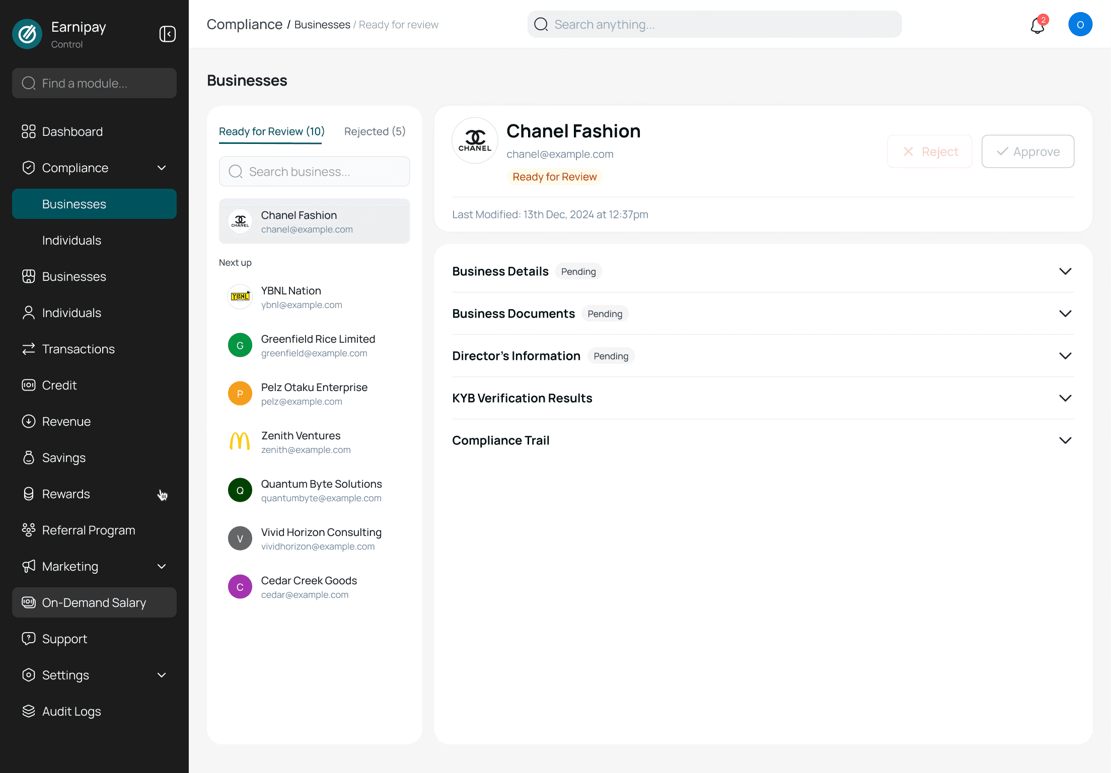
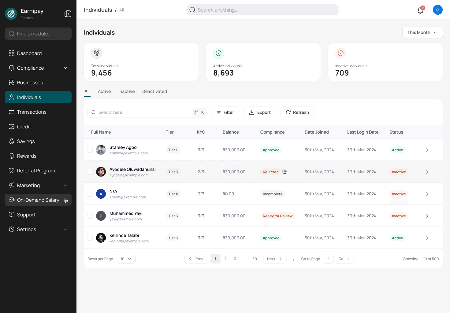
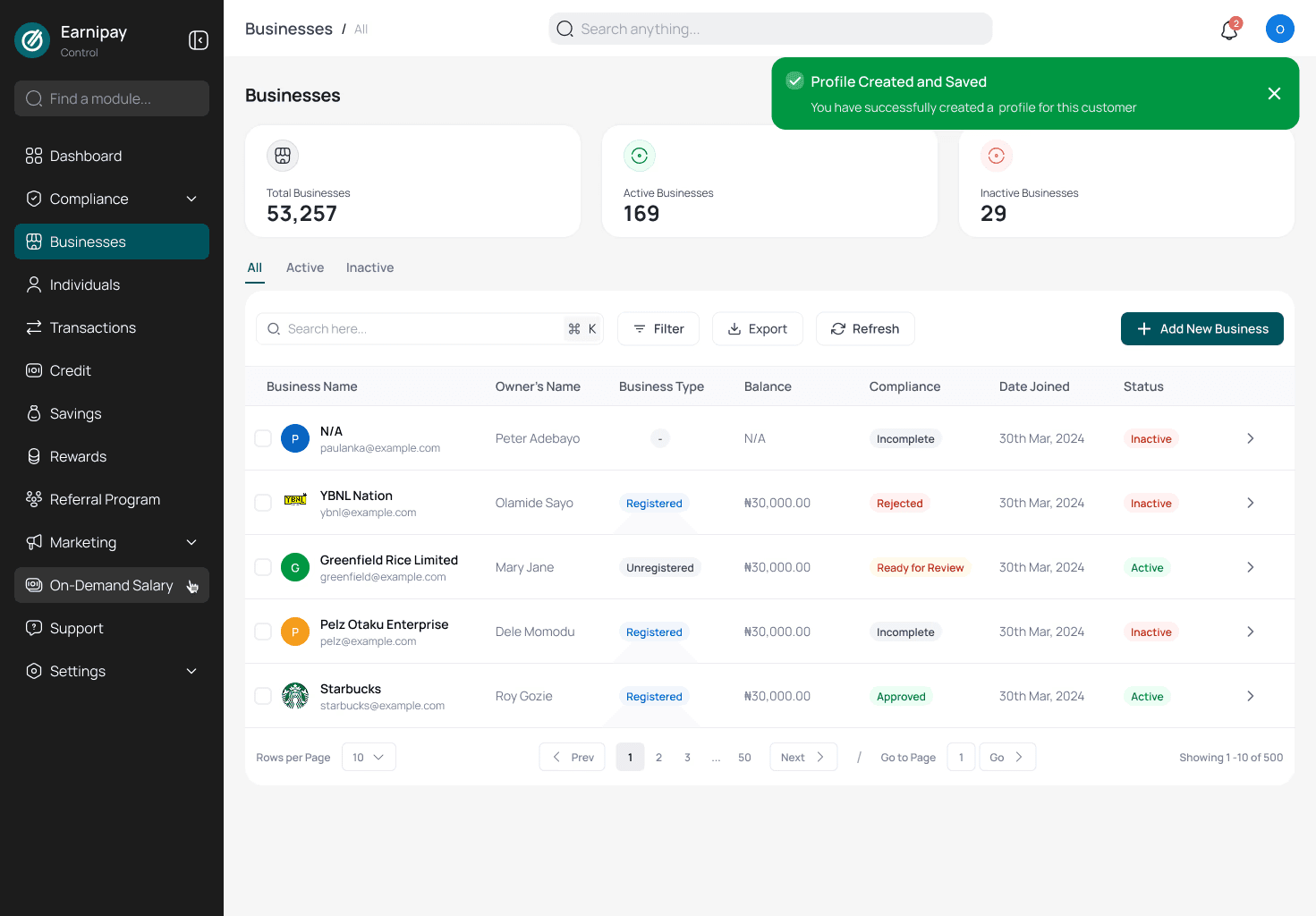
Grouped related functions (e.g., compliance, transactions, accounts) into a clear sidebar menu.
Defined a consistent page layout: header, action bar, data table, detail drawer.
Wireframing & Prototyping
Sketched low-fidelity flows for key tasks: bulk approvals, account setup, compliance checks.
Built interactive hi-fi prototypes in Figma using a shared component library.
Design System & Visual Refresh
Created a unified UI kit: consistent buttons, form fields, icons, and color palette (soothing blues and greens).
Updated typography for readability and added generous white space to reduce clutter.
Usability Testing & Iteration
Tested with 2 admins running real scenarios.
Tweaked filter options, added keyboard shortcuts for bulk actions, and clarified status badges.
Developer Handoff & QA
Delivered detailed specs and interactive tokens.
Paired with engineers during a two-week sprint to ensure pixel-perfect implementation.


Results & Impact Faster
Approvals: What used to take 5 minutes now only takes 3.
Fewer Mistakes: Mis-approvals dropped by about one-third thanks to clearer status labels and confirmation pop-ups.
Widespread Use: Within two weeks, 9 out of 10 admins were already using the bulk-approve feature.
Higher Satisfaction: The back-office team rated the new design 4.6 out of 5 (up from 3.1).
Quicker Training: New hires learn the system in half the time.
Conclusion
By reorganizing information, streamlining key workflows, and applying a calming, modern aesthetic, we transformed Earnipay’s back office from a source of frustration into a productive command center. Teams now move faster, make fewer mistakes, and enjoy a clearer view of business operations.