BACK
Earnipay — Get Personal With Your Money
Role
Senior Product Designer
Duration
3months
Sector
Finance

Context
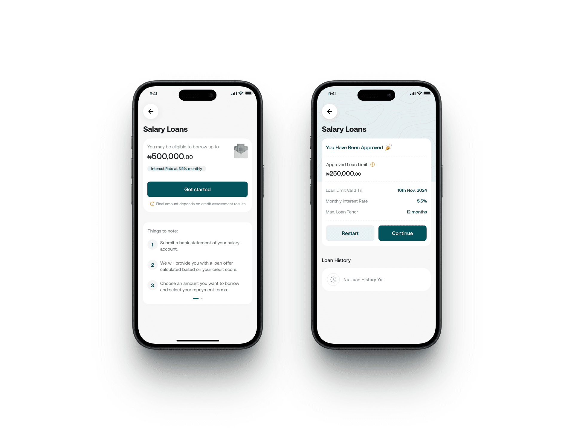
Earnipay is a mobile app that lets Nigerian workers get part of their salary before payday. Many people struggle with unexpected expenses and end up borrowing at high interest rates. I joined the team to make the app feel easy to use and reassuring when money is tight.
Many salary-advance apps hide fees, force rigid savings plans, and bury helpful features. Earnipay wanted to boost retention by folding simple savings, insights, and rewards right into the advance flow. As Senior Product Designer, I owned user research, screen designs, UI copy, visuals, and the handoff to engineers.
Core Problem
Two main issues made people give up on the app:
Too many steps at signup made people bored and leave halfway.
Important features were hidden, so people didn’t find rewards or savings insights.
Key Painpoints
Signup Overload: Five or more screens with no progress bar caused half of new users to quit.
Hidden Rewards: Fewer than 1 in 10 users discovered the points and cashback feature.
No Guidance: Users didn’t know how to enter their bank details or verify their identity in the app.
Missing Spending Summary: No clear way to see where their money went.
Cold Look and Feel: The design looked generic and uninviting.

How We Solved the Problem
Data-Driven Discovery
Used Mixpanel to track the onboarding funnel, pinpointing exactly which screens caused users to drop off.
Interviewed 20 users & surveyed 150 more to validate pain points.
Streamlined Onboarding
Cut signup to two screens with a clear “Step 1 of 2” and “Step 2 of 2” label.
Embedded in-app USSD/WhatsApp guides for BVN/NIN, so users never left the app.
Uncovered Rewards
Moved “Earn Points” onto the main screen.
Prompted users to tag each transaction (e.g., Food, Transport) to instantly earn points redeemable for cashbacks and discounts.
Launched Spending Insights
Built a simple pie chart dashboard showing expense categories and “Top 3 spends.”
Displayed “Points earned this month” alongside spending breakdown.
Added Friendly Competition
Introduced a leaderboard so users could see who had the most points each week.
Modernized the UI
Switched to warm colors and glass-like elements.
Added haptic feedback on the advance slider and live-balance animations.
Rewrote all copy in active, empathetic voice


Results and Impact
Signup Completion rose from 50% to 78%.
Rewards Discovery jumped from 10% to 80% of users.
Transaction Tagging increased to 65% of users tagging their spending.
Dashboard Visits went up to 70% of active users checking their spending chart.
Leaderboard Use saw half of active users joining in each week.
One-Month Return improved by nearly a quarter among users using the new features.
Support Questions about signup and errors dropped by 40%.
Conclusion
By cutting out extra steps, making rewards easy to find, and showing people how they spend, we turned a confusing app into a helpful money tool. Users felt more confident and stayed engaged. Next, I’m exploring personalized tips that suggest smart saving habits based on each person’s spending patterns.